Apothecary — Heretic campaign art direction
HERETIC.
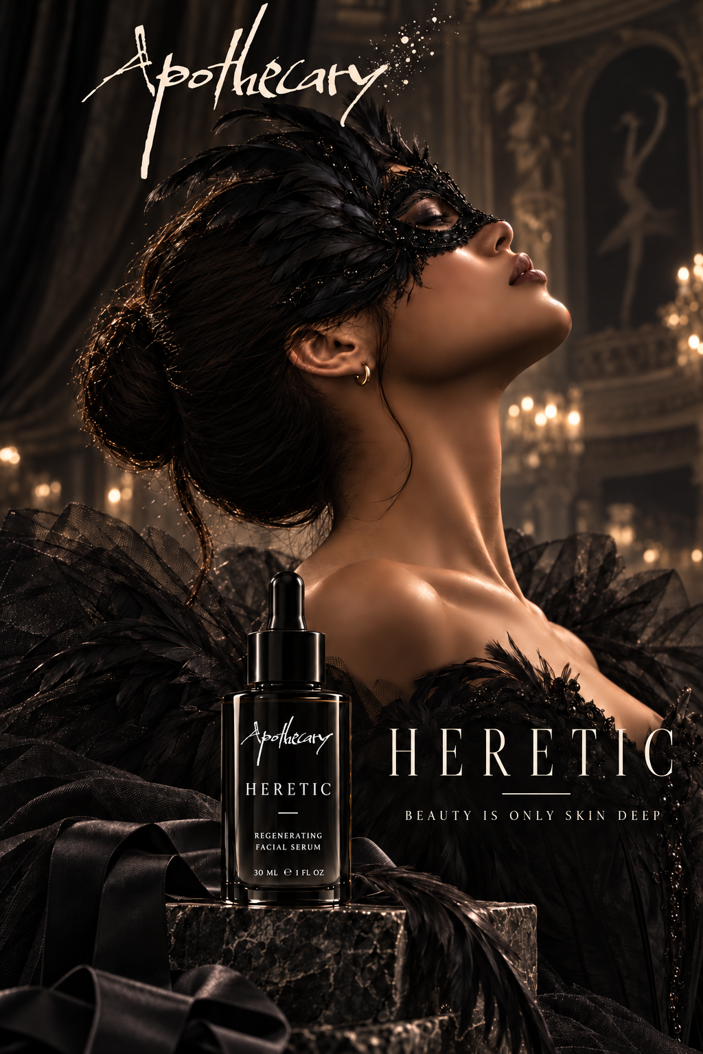
For Apothecary's upcoming Heretic skincare launch, I developed the campaign concept, art direction, typography, product-line visual design, and promotional compositions. The goal was to create a dark, high-fashion world that made the range feel distinctive, premium, and visually memorable.
BEAUTY IS
ONLY
SKIN DEEP.
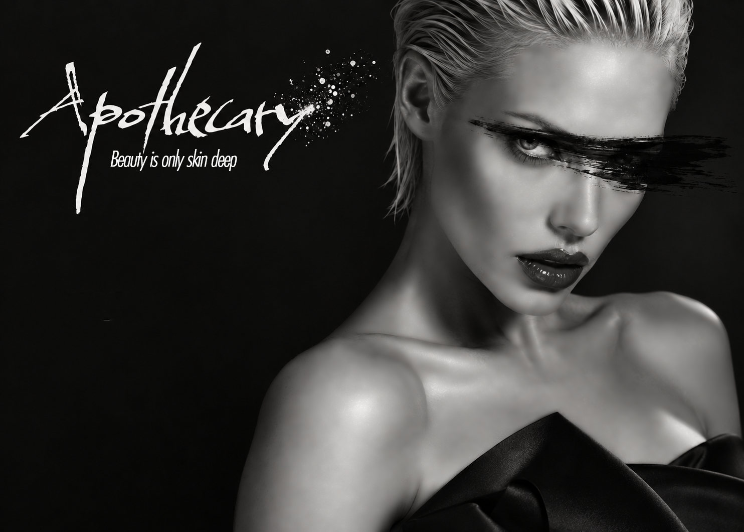
“Beauty is only skin deep” is usually said to diminish the importance of appearance. I used that familiar phrase as the campaign's provocation — mocking the dismissal and giving it a positive meaning in the context of skincare. That contrast became the foundation of Heretic's attitude and visual storytelling.
THE
VISUAL
WORLD.
Dramatic portraiture, deep shadows, black-on-black product presentation, and fashion-led compositions establish a more defiant beauty language. I wanted the campaign to feel luxurious without becoming conventional.
ONE VISUAL
LANGUAGE.
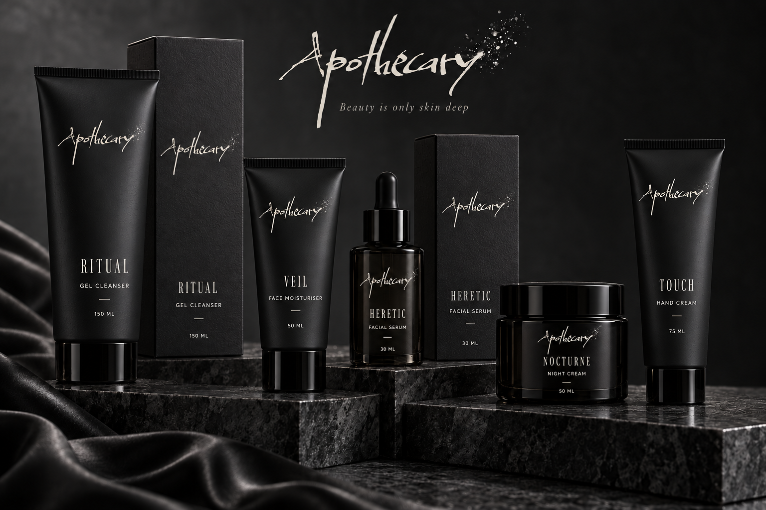
Across the range, black packaging, the expressive Apothecary mark, restrained typography, and consistent product hierarchy create a recognizable family while allowing individual products to retain their names.
THE
COLLECTION.
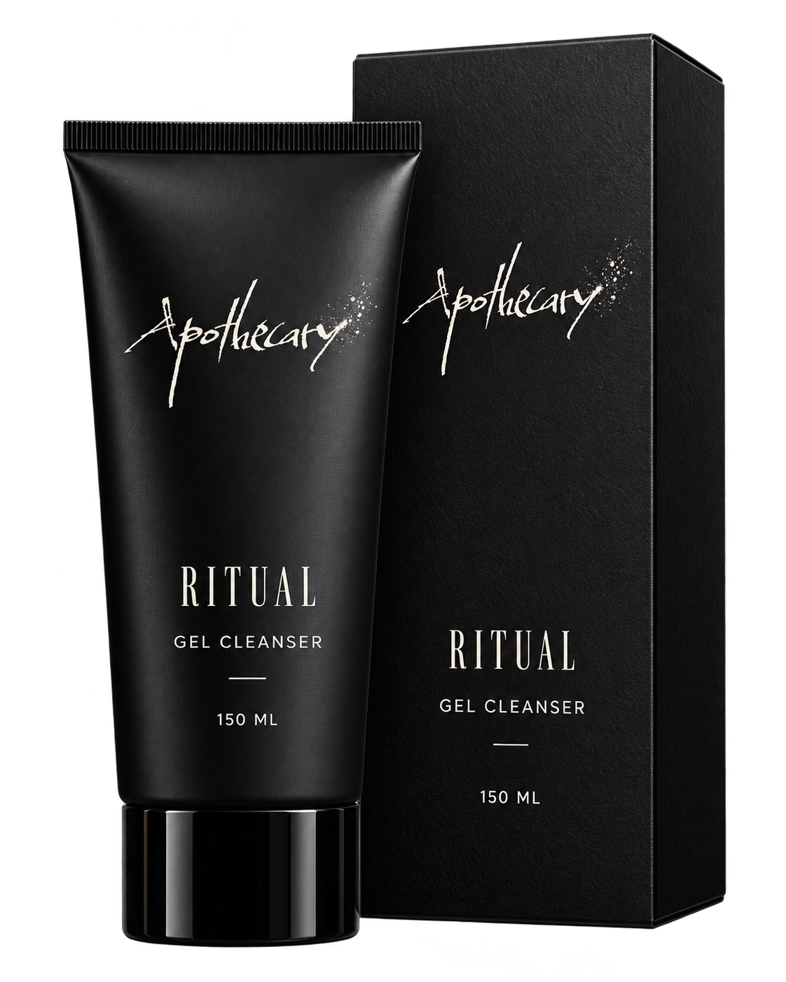
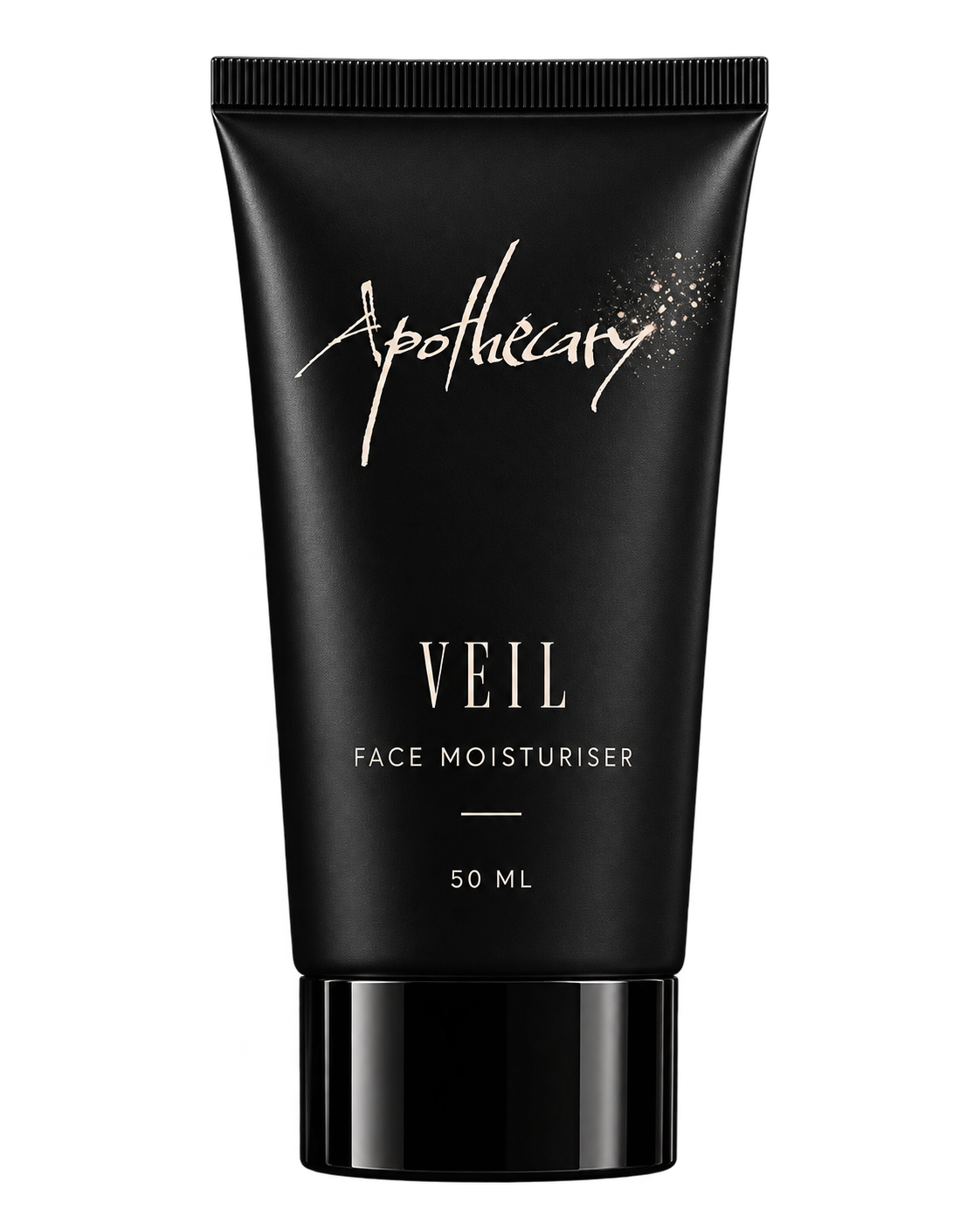
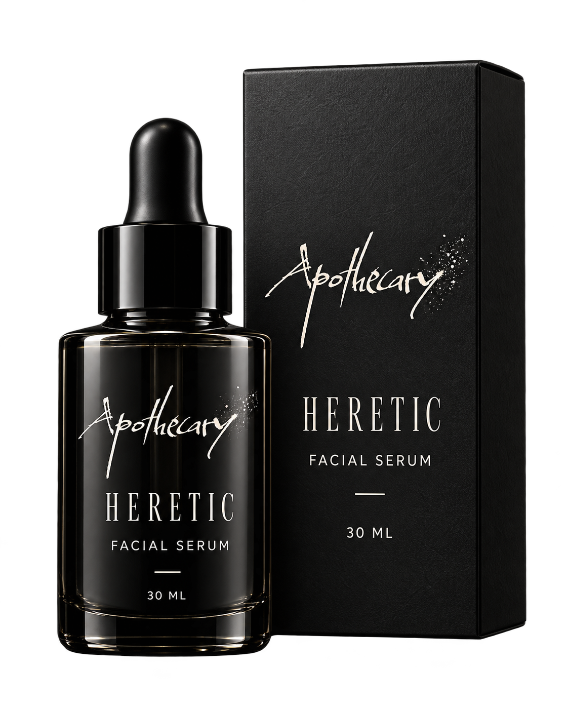
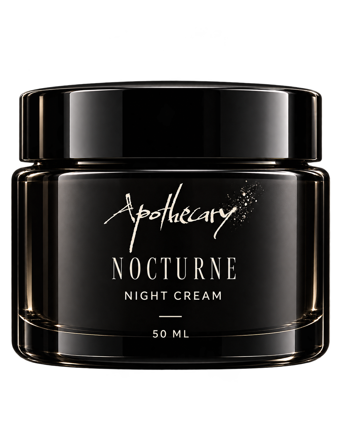
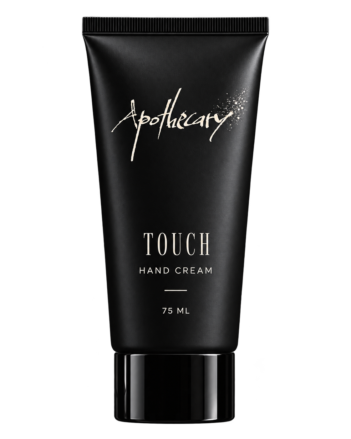
SWIPE OR USE THE ARROWS TO VIEW ALL FIVE DESIGNS
A DISTINCT
CAMPAIGN
IDENTITY.
The Heretic work brings the launch concept, fashion imagery, typography, and product-line presentation into one cohesive visual direction. Every composition carries the same dark, provocative character — from the campaign image to the individual skincare products.
BACK TO SELECTED WORK